
An Elevated Design System
Philosophy
Elevated™ was built upon the need to easily evaluate and facilitate building interactions with a secure, modern, and efficient design.
Our brand identity is differentiated through key elements like typographic pairings, colors, and expert-built UX/UI. The Elevated brand speaks through evidence-backed messaging, proven in collected metrics. Our messaging balances tech innovation with the human experience.
The Elevated brand’s activity and messaging aren’t limited to only tech-based interests, but the very experience, the human experience, for which and for whom it’s been developed.
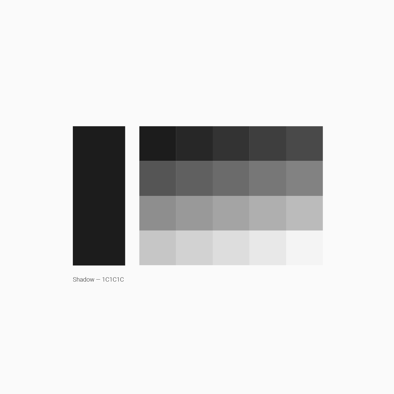
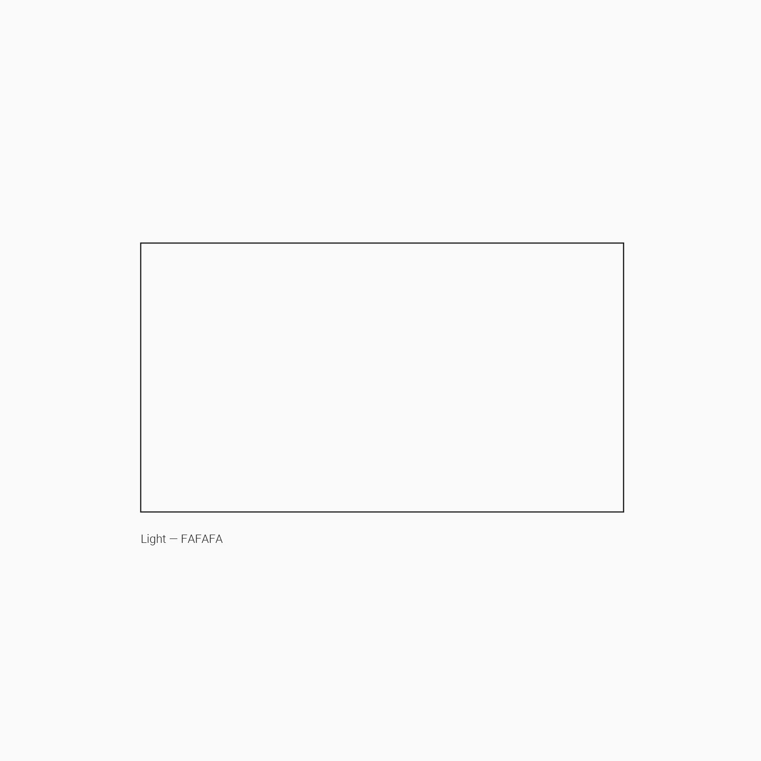
Color
Our palette is geared towards simplicity and modernity.
Font

Our typeface is the vehicle used to communicate who we are.
Elevated’s typeface, Roboto, captures both tradition and adventure. It effectively communicates our identity across print and digital.
Logo
The Elevated markup identifies and communicates our brand identity in all places and times.

Heavy
-
The heavy logo is our most bold and easily recognizable logo, used as the primary brand mark.
-
Heavy is the primary mark used across the application, social media posts, and app store icons.

Powered
-
The secondary lockup, combination of wordmark and blueprint, draws our brand’s focus on connection and supportive structure.
-
Used primarily in print and digital media only when the heavy mark would create uneven weight on the design, or would draw too much attention to the logo.

Landscape
-
This lockup, identical to the stacked lockup aside from visual positioning, is used only when less vertical space is available for logo placement.
-
Used primarily in print & digital media only when the heavy mark would create uneven weight on the design, or would draw too much attention to the logo.

Stacked
-
Powered by Elevated identifies the app utilizing Elevated™ terminology.
-
Used primarily as the Elevated software logo, digital branding, and social media. Best for places where the brand can be introduced and may be held on the screen for an extended bit of time to increase readability.
Our logo is steadfast, simple, and complex in the same breath. Highlighting our commitment to exploring the blueprint of connection and delivering perspective in space — a visual experience reflecting our intent and purpose.
Cinematic Aesthetic
Our cinematic style evokes place, emotion, and memory.

Prioritizing the human experience through connection, we focus on the details that shape and define user interactions.
Our core pillars of photography:
Community and culture
Health and wellness
Insights and analytics
Real estate performance
Sustainability and responsibility
Iconography
Our icons define our goal of being simplistic and well-defined.
Emphasizing ease of use and tranquility of the app, we worked to define a style of icons that promoted speed of readability for a variety of consumers.
The four Elevated™ icons:
These four icons are a set designed for the sole purpose of efficient navigation within the Elevated™ app.

